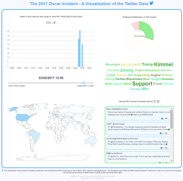
This project was created during the course "Visualization 2" at the University of Technology Vienna in the summerterm of 2021. It visualizes Twitter data from Tweets published in the timeframe of 27th of February to 3rd of March 2017 with the Hashtag #Oscars. This timeframe starts after the 89th Academy Awards, where the movie La La Land was wrongfully announced as the winner for Best Picture instead of the real winner Moonlight.
The dropdown on the top left determines the timestep in which the user can select a time. Possible values are "days", "hours" and "minutes". When changing this value the TimeSlider is adjusted as well.
The dropdown on the right side determines the number of tweets shown in the TweetView. Possible values are "10", "50" and "100".
The TimeSlider determines the time from which the Twitter data is shown. Depending on which value is chosen in the dropdown the user can select a specific day, hour or minute. The timezone of the TimeSlider is UTC-5.
The BarChart shows the amount of Tweets tweeted in the selected timeframe. Depending on the value selected in the dropdown the amount of tweets per hour are shown for "days", the amount of tweets per minute are shown for "hours" and the amount of tweets per second are shown for "minutes". The scale on the y-axis is adjusted by the maximum number of tweets. When hovering over each bar the actual number of tweets is shown as a tooltip.
The WorldMap shows the activity per country. The darker the color of the country appears, the more tweets were published during the selected timeframe. When hovering over a country, its name is shown as a tooltip.
The PieChart shows the sentiment of the tweets in the timeframe. When hovering over a sector of the piechart the percentage is shown in the center and the amount of tweets with the sentiment of the sector is shown as a tooltip. The other sectors are greyed out. The red sector is associated with tweets with a negative sentiment. Green shows the data for positive sentiment and beige shows the data for the tweets with neutral sentiment. The title displays how many tweets in total were analyzed. When clicking on a sector the sentiment is selected and the WordCloud and TweetView are updated.
The WordCloud shows the most used word of the tweets in the timeframe. When selecting a sentiment, the WordCloud is adjusted and the most used words of the positive, neutral and negative tweets are shown respectively.
When selecting a sentiment in the piechart, the TweetView shows the tweets with that sentiment. Depending on the dropdown value 10, 50 or 100 tweets are shown. When clicking on a single tweet, one is redirected to the original tweet.
When clicking on the Twitter logo one is redirected to twitter.com. When clicking on the words "2017 Oscar Incident" one is redirected to a video showing the incident.